Graphic Design | 3D Modelling
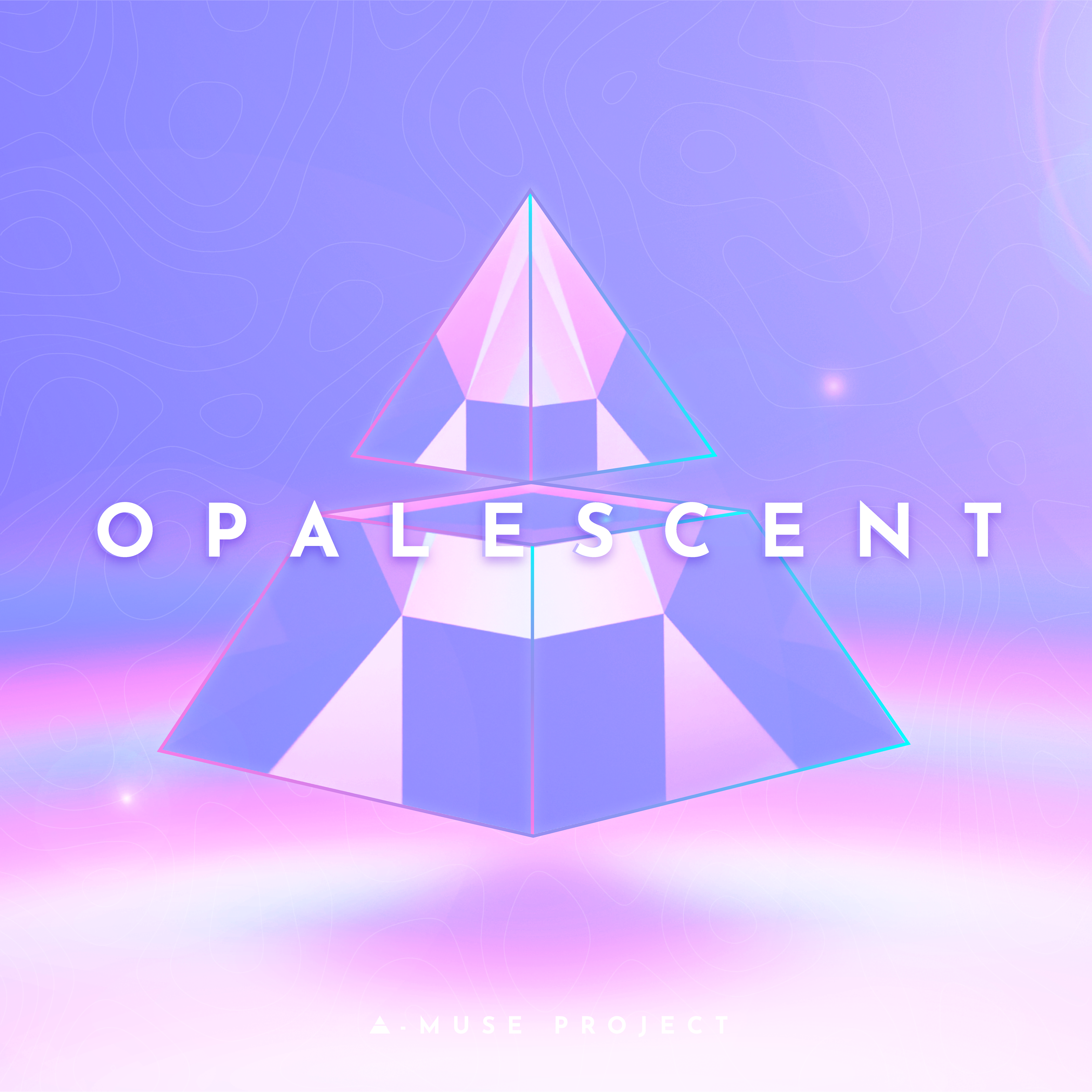
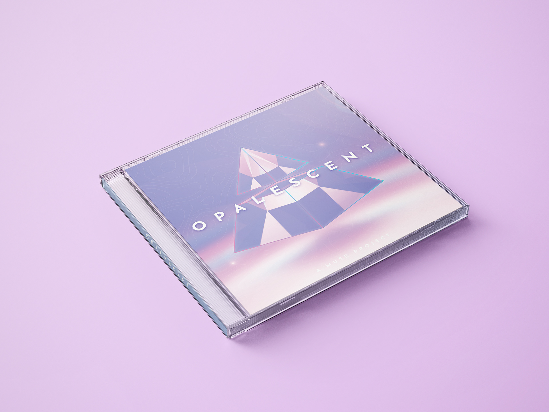
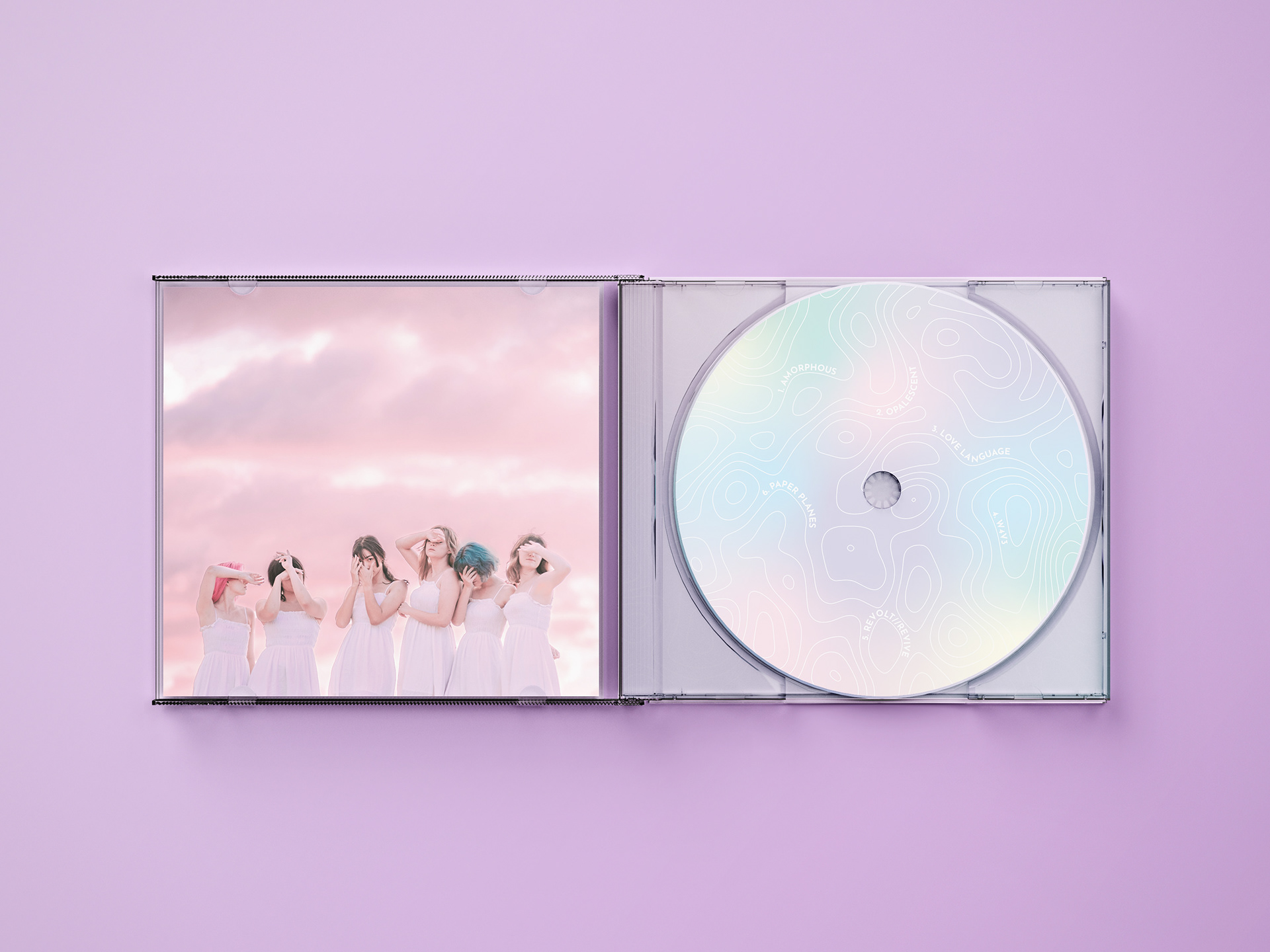
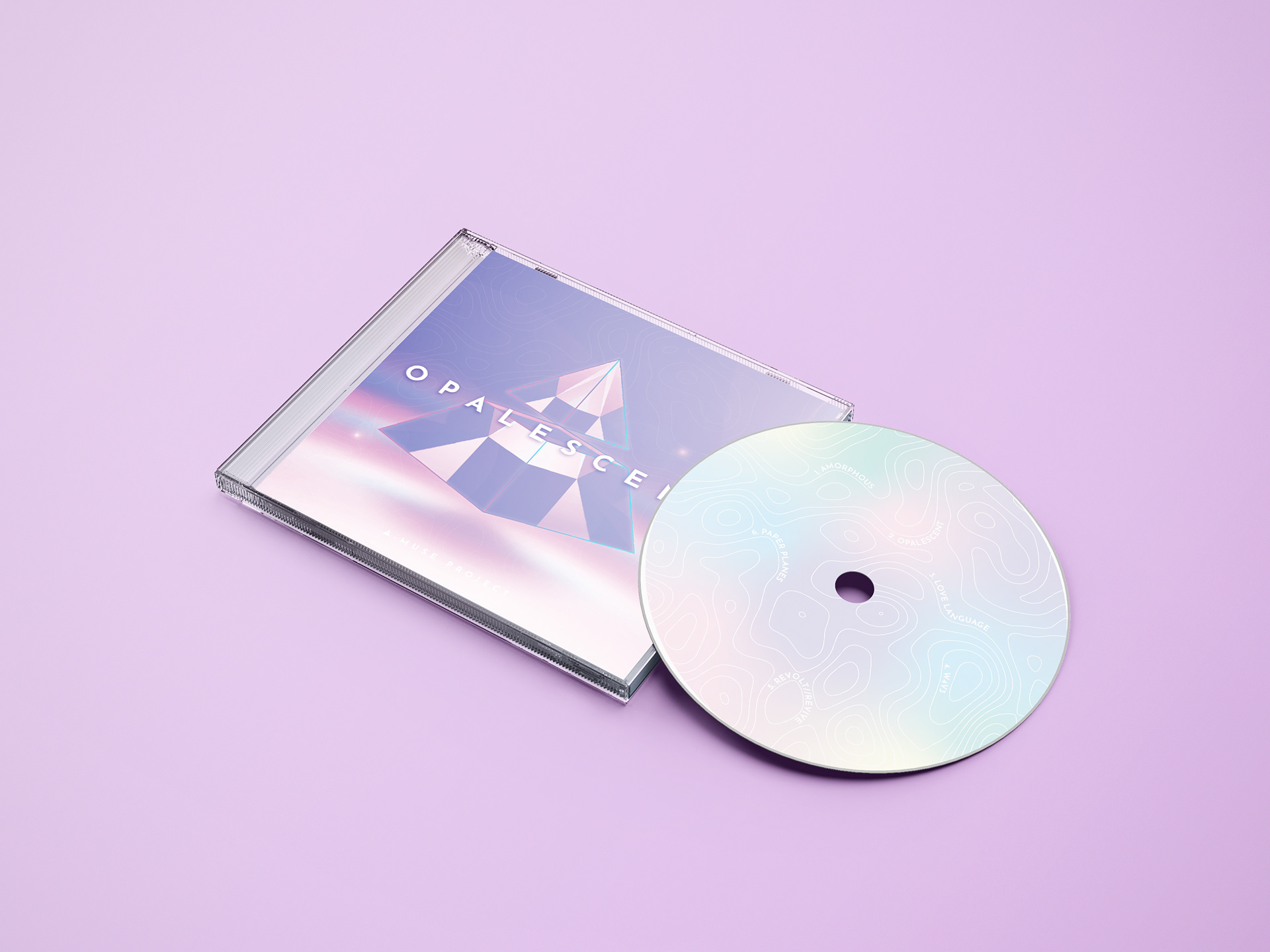
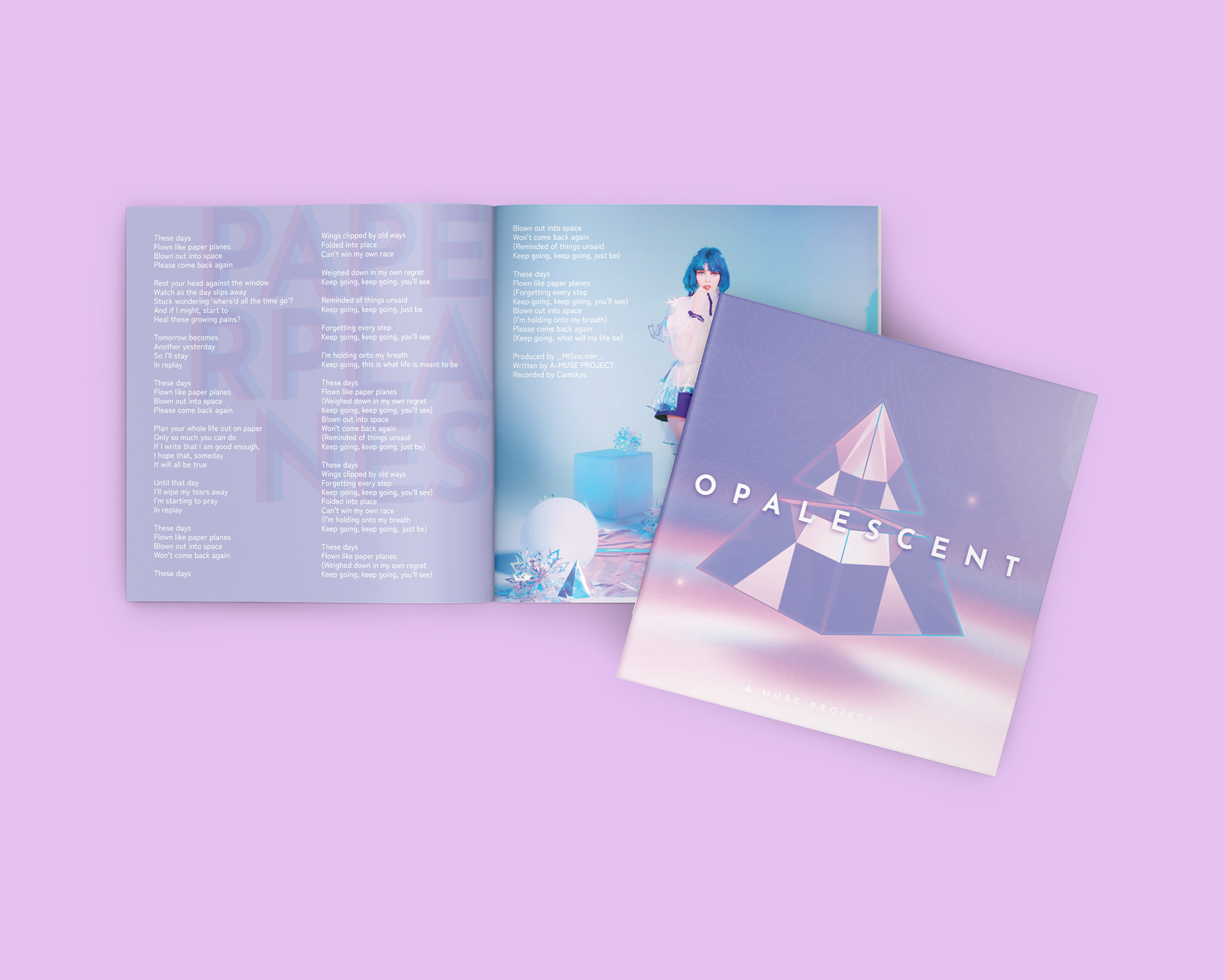
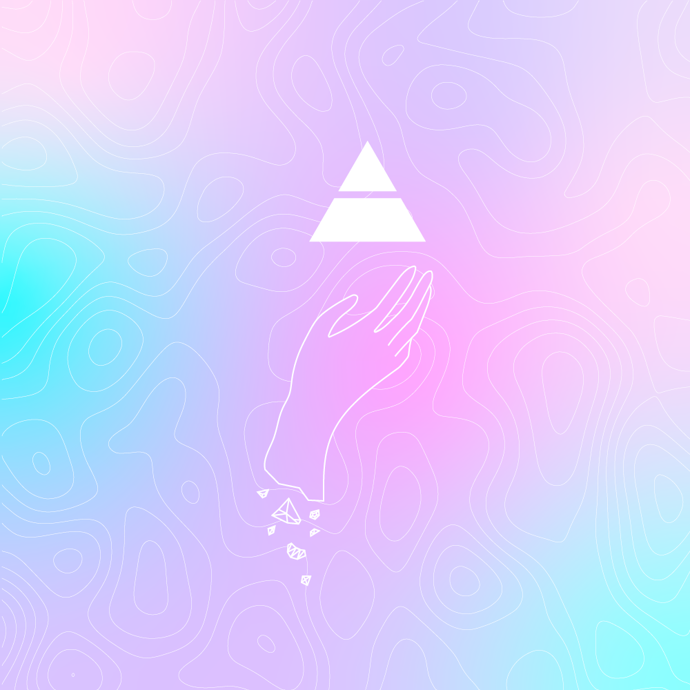
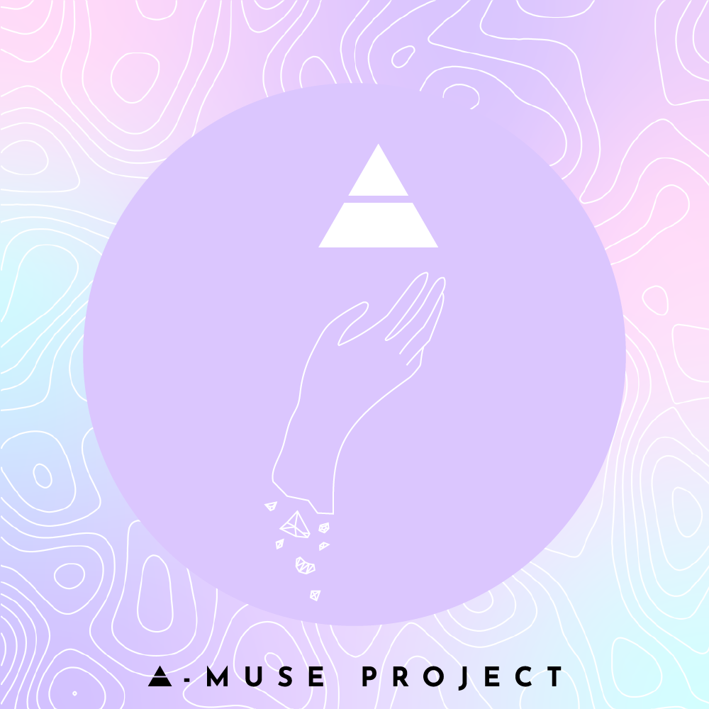
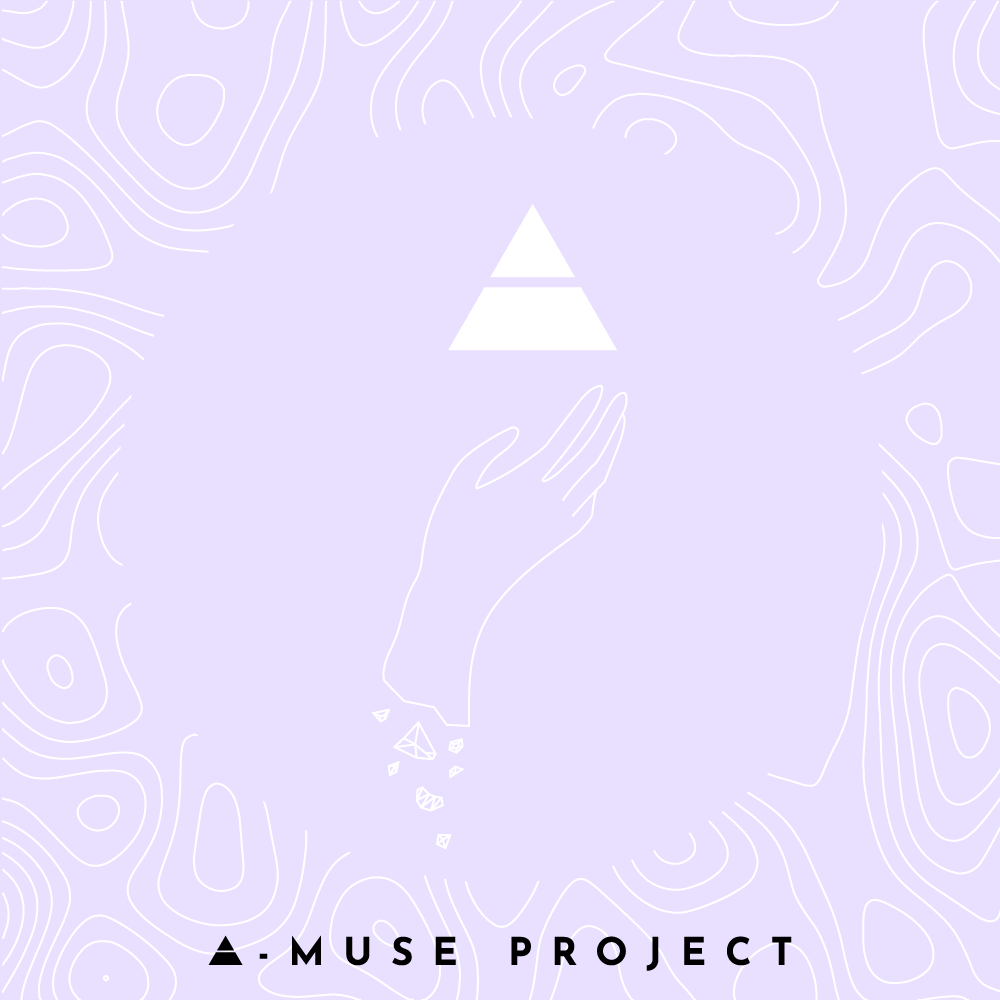
The concept of 'Opalescent' draws analogies between the multi-coloured sparkle of opals and the different sides of the self. As an Australian idol group, we also wanted to pay homage to our Aussie roots, as a country renowned for high quality opals. The EP was designed as a journey through the different facets of ourselves, the sounds and lyrics are reflections of our personal sentiments and identities, as individuals and as a group. I have also designed the accompanying visuals and merchandise carefully with these sentiments in mind.
This cover was created using a mixture of Blender, Photoshop and Illustrator.
Process Diary
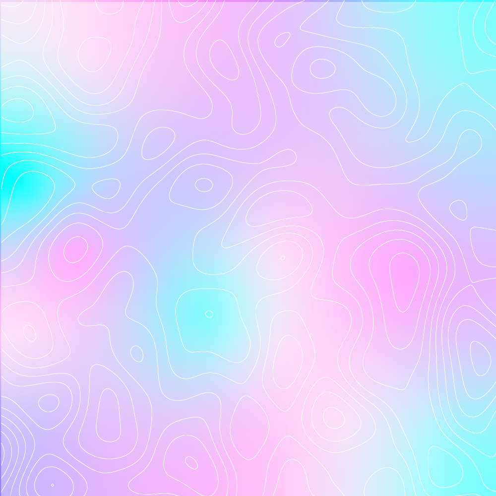
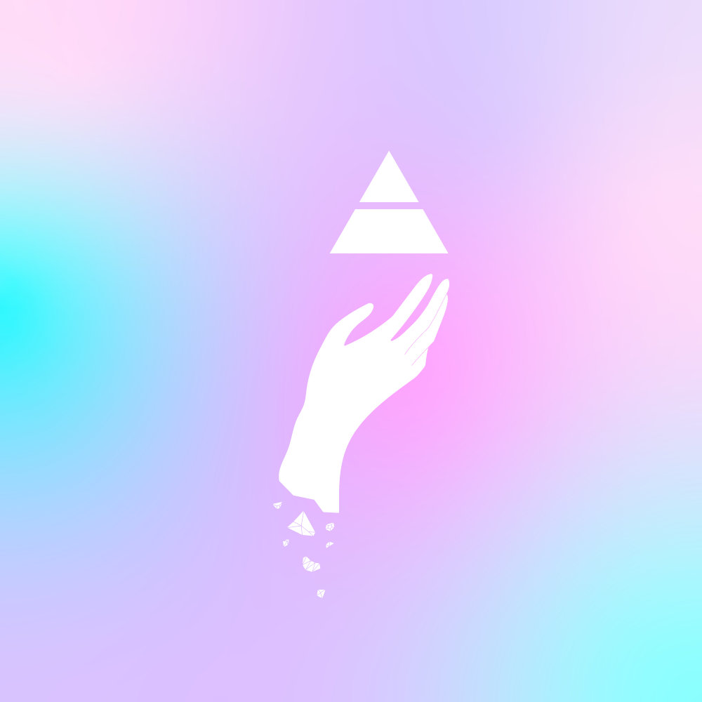
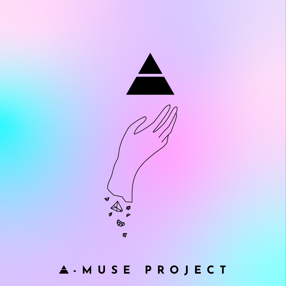
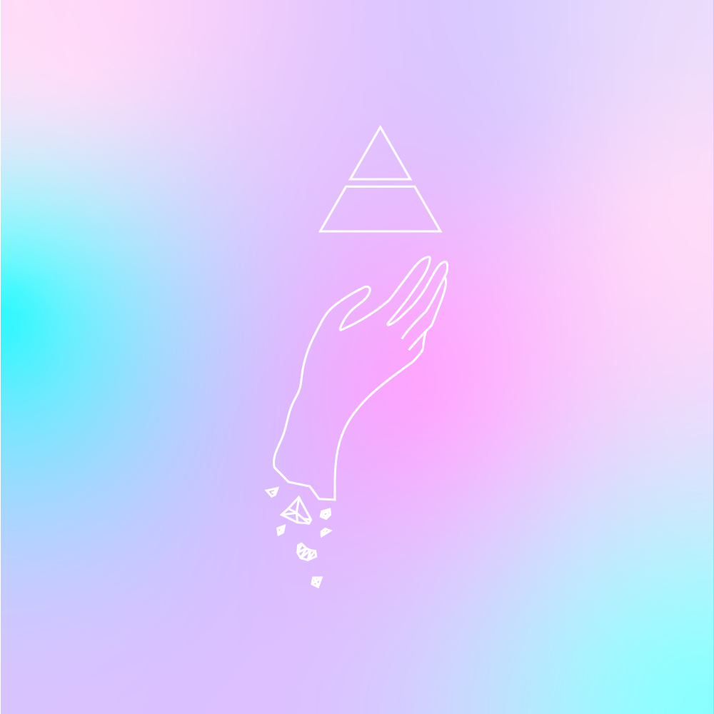
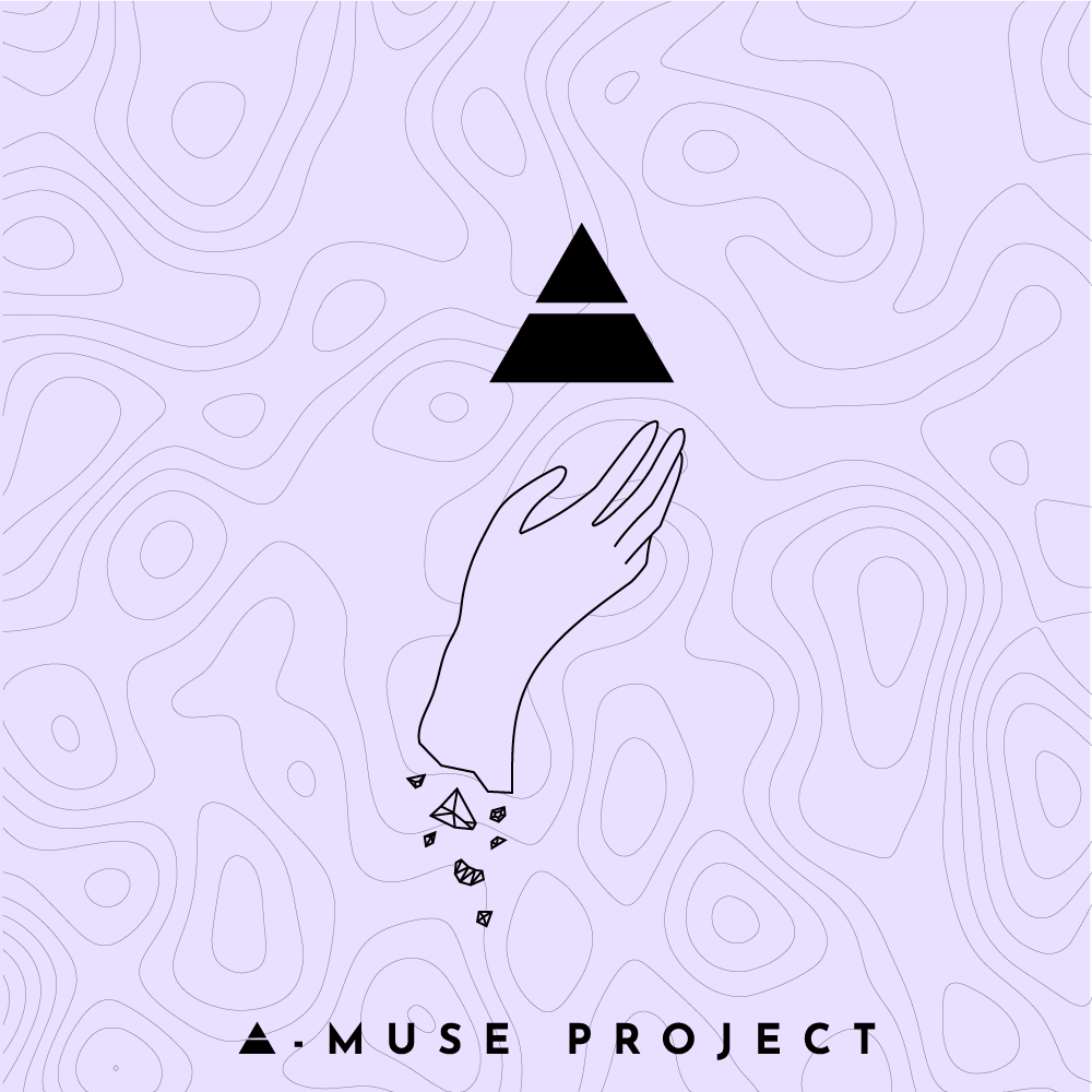
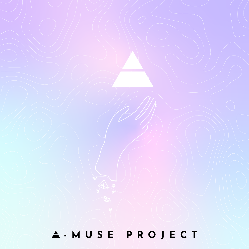
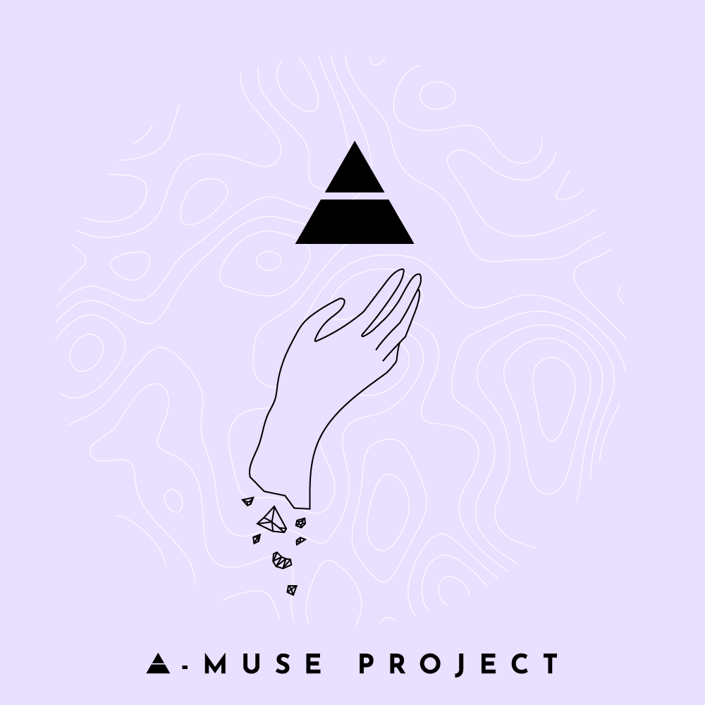
I started with these sketches I made in Procreate and images for inspiration - The hand motif came from a very literal interpretation of the self being like an opal - made of shiny, reflective stone. The split prism is the 'A' in A-muse. The hand illustrations were axed for the final product - but the contour image I created ended up being used the whole way through the project in a lot of different assets to help add extra dimension to the gradients. These were my first few experiments - everything was too flat.
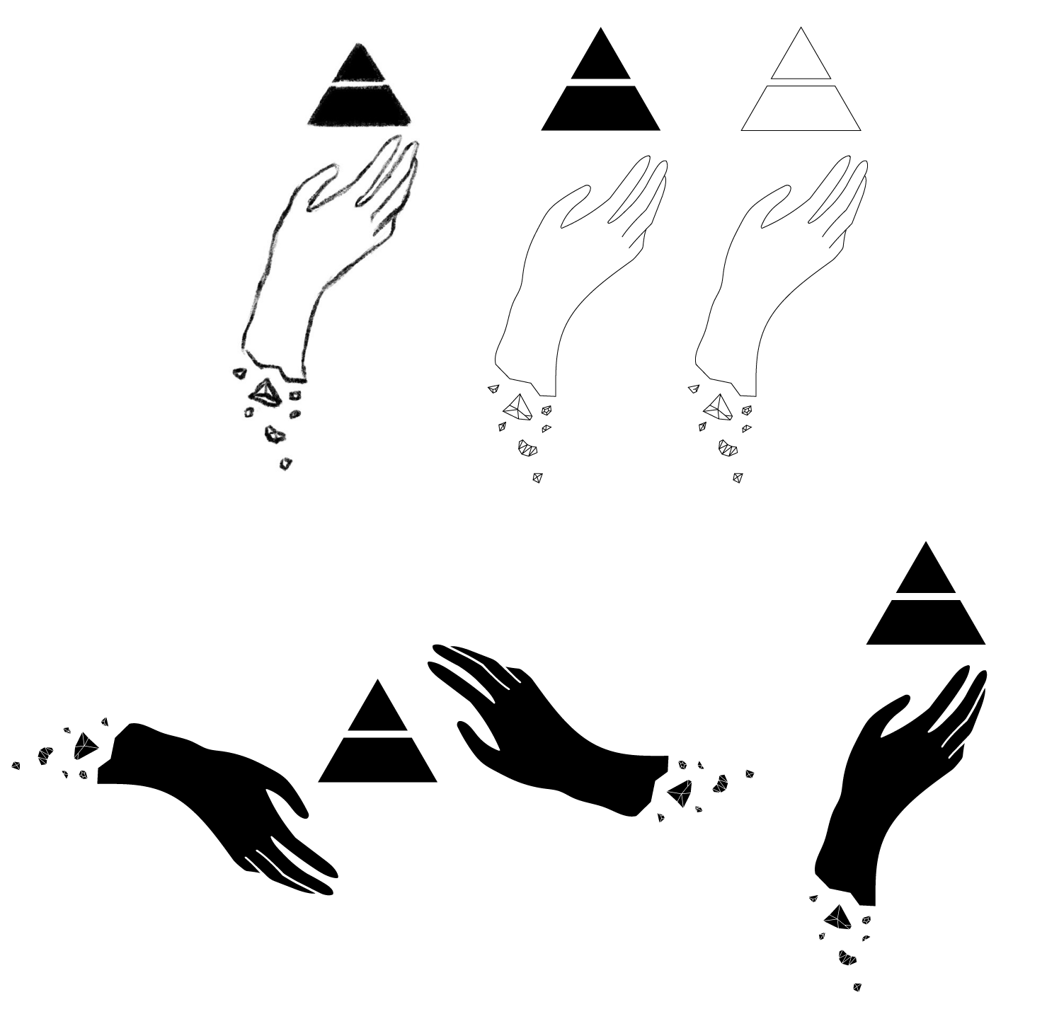
Original Motif Sketches
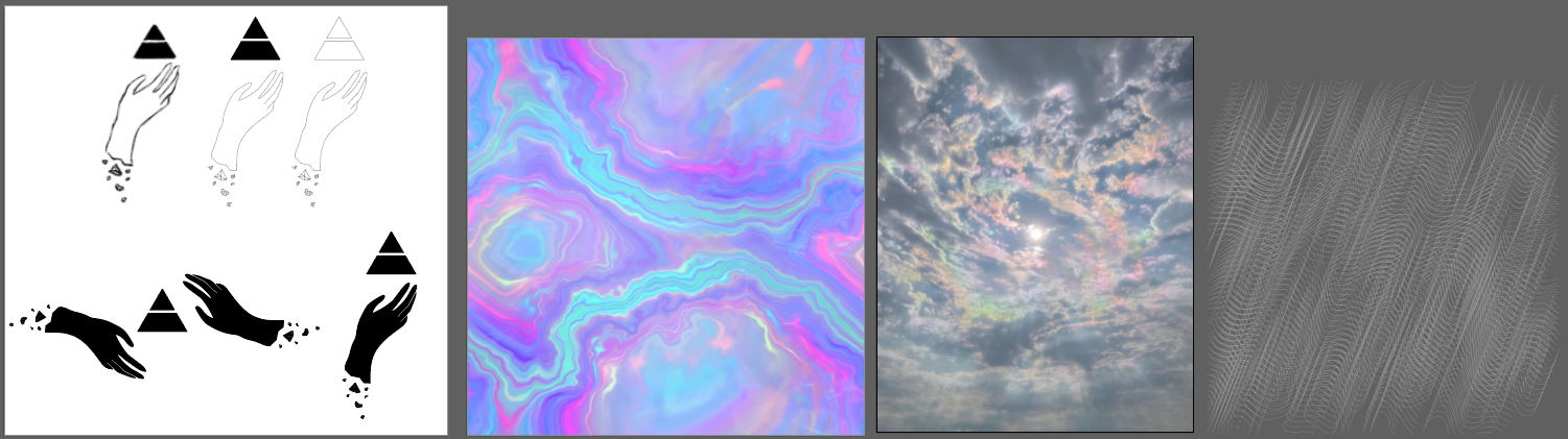
Where I started to play in Illustrator...
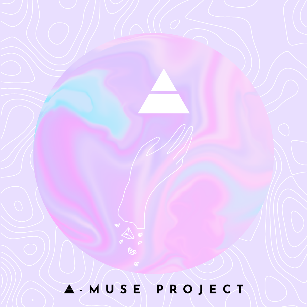
I worked solely in 2D at first for this cover, but wasn't achieving the desired aesthetic with the opal theme, so decided that I needed to explore 3D to get the results I was after. I had basic 3D skills prior to this but creating this cover artwork pushed me to explore lighting and caustics in a way that I never had before. I also had to install an experimental version of Blender to get the exact results I was after...
I tried working with some abstract shapes that reminded me of the stone contours I created in Photoshop, but it was giving too much chrome and not enough crystal, so I moved to the prism imagery instead.

The prism model - I rendered a few videos of it spinning for usage in our video assets for our Opalescent live show.
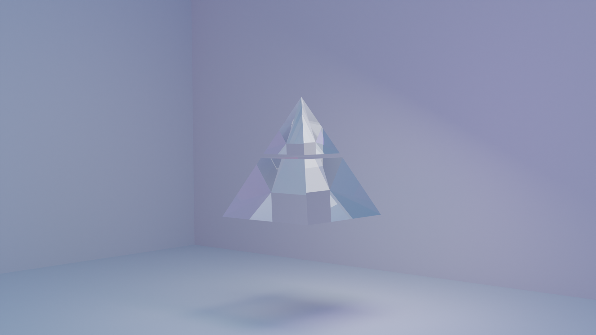
Prior to adding rainbow lighting - at this point I was still experimenting with textures and caustics, and the background hadn't become a cyclorama yet.
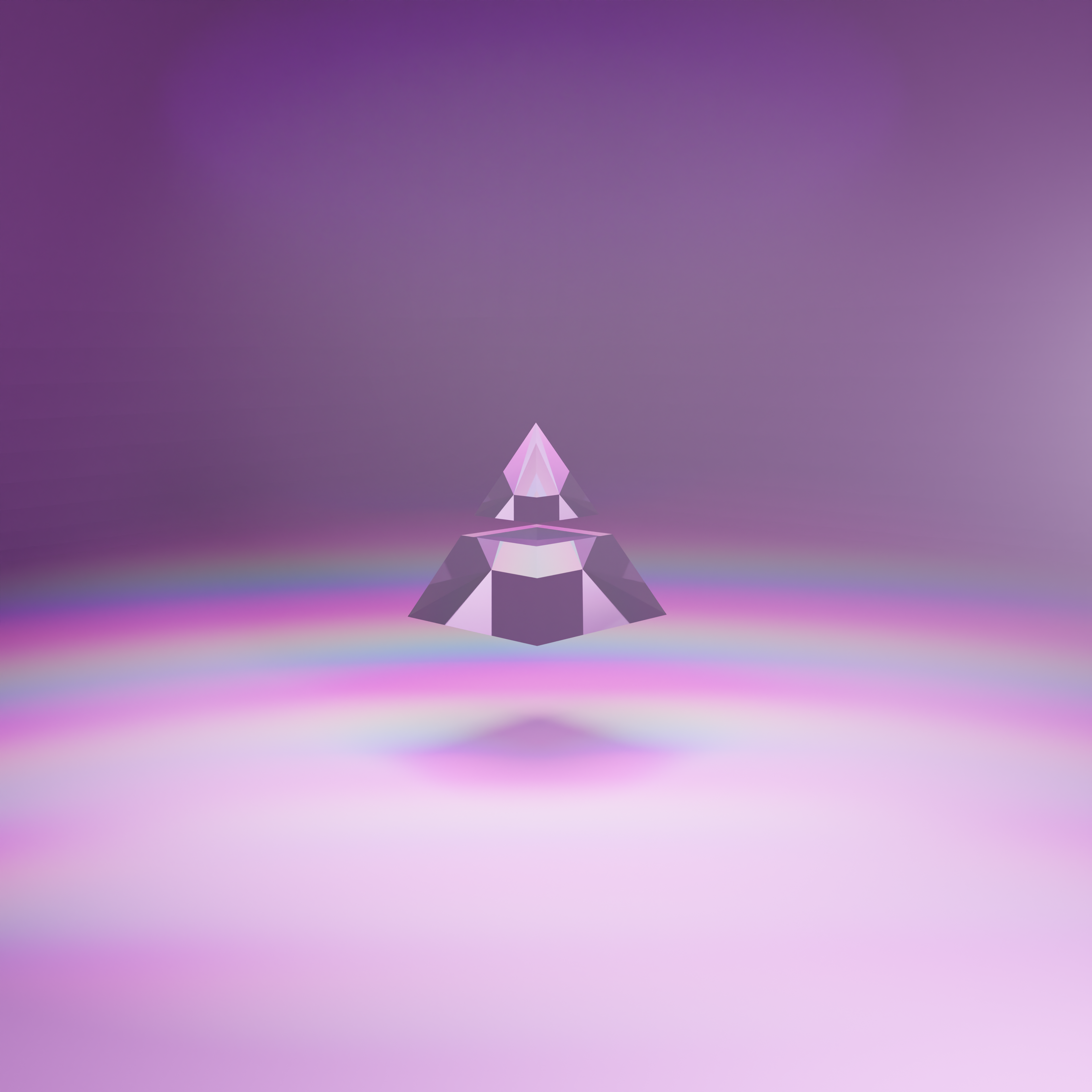
Voila! Rainbow lights + caustics achieved. I am the boss of the node editor now.
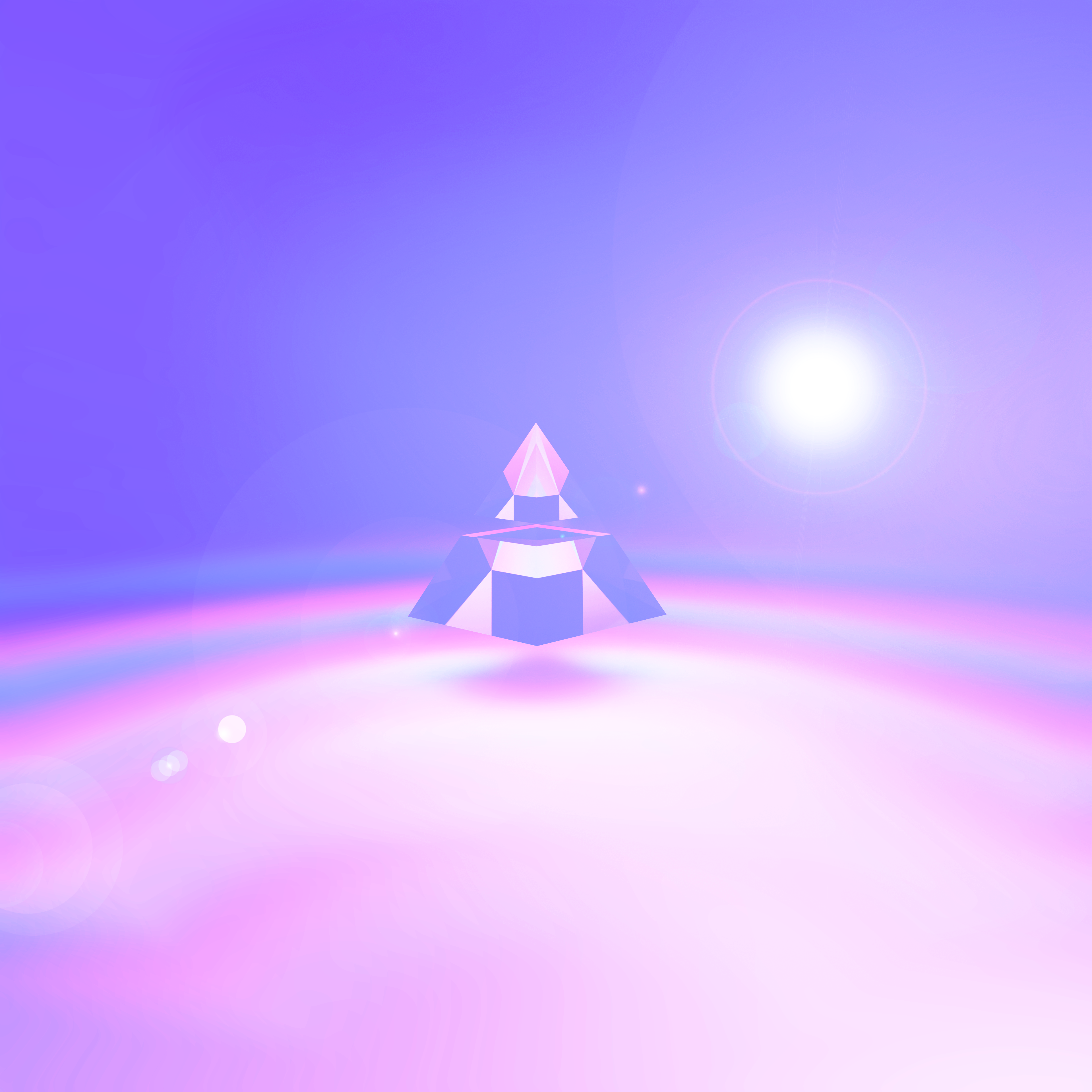
Colour grading + Photoshop play gave us the final render!
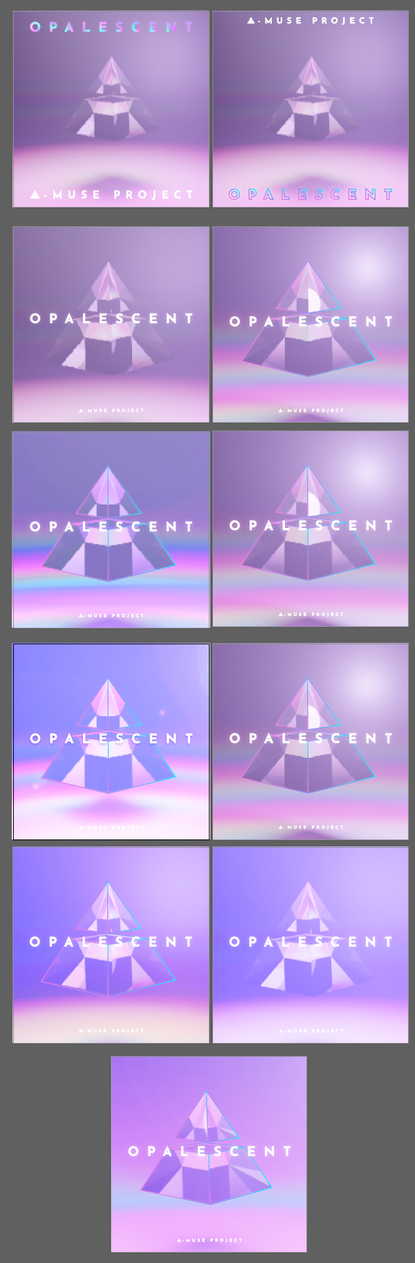
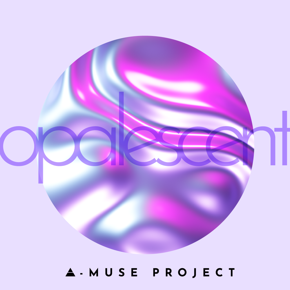
A few iterations later...
The final product - prior to CMYK colour correction. This is the image we used across streaming platforms as our digital cover. The version you see in the mock-ups has been colour corrected for printing.